Moteado Mezcal Brand
A brand identity that embodies the entrepreneurial spirit of the founders and the funkiness of a new mezcal.
Client:
Moteado Mezcal
Date:
2019-2020
Scope:
Brand definition
Visual identity System
Brand Guidelines
Creative Direction
Messaging


Design Direction
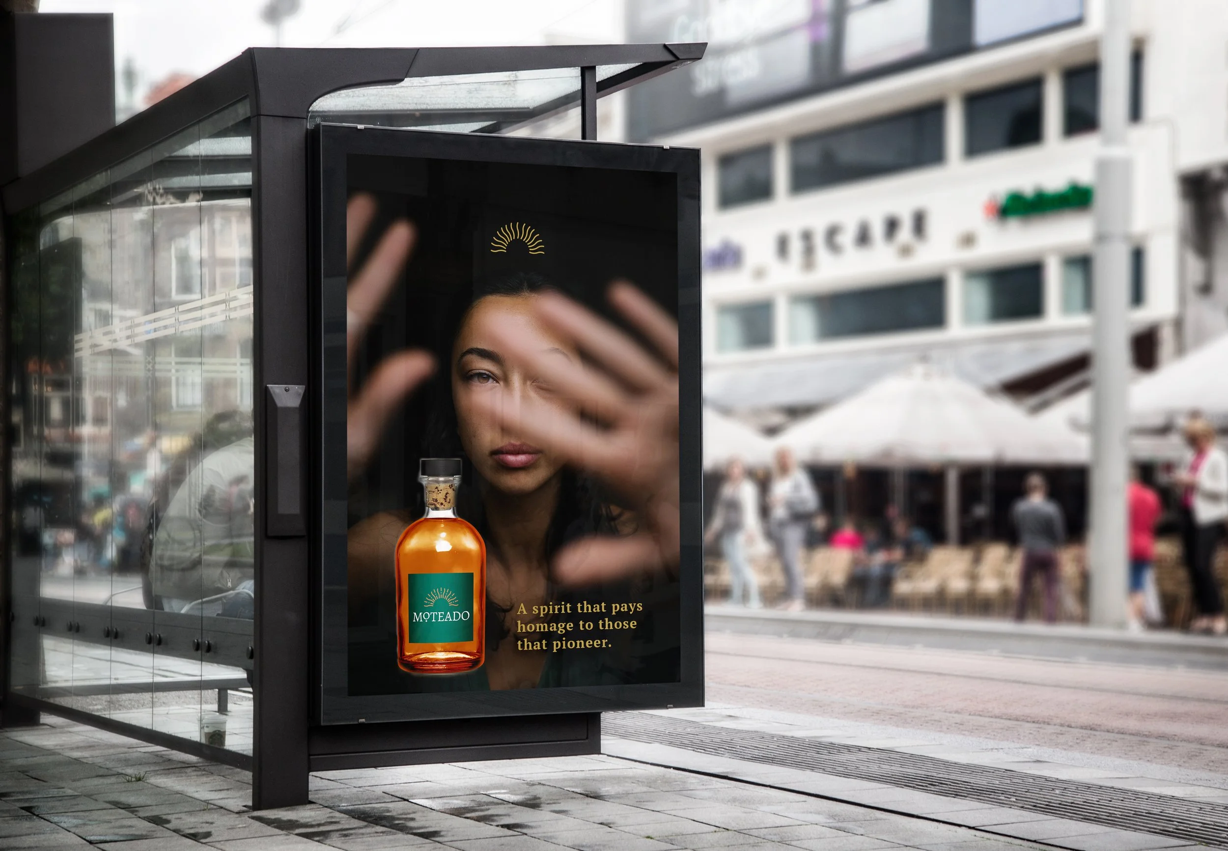
The approach for this identity was centered around the concept of new nobility — what does it mean to be noble today? We wanted to capture the essence of grit and perseverance of a migrant's journey, the beauty and strength of the monarch butterfly. Key words for this brand are: Genuine, Alluring, Noble, Driven.

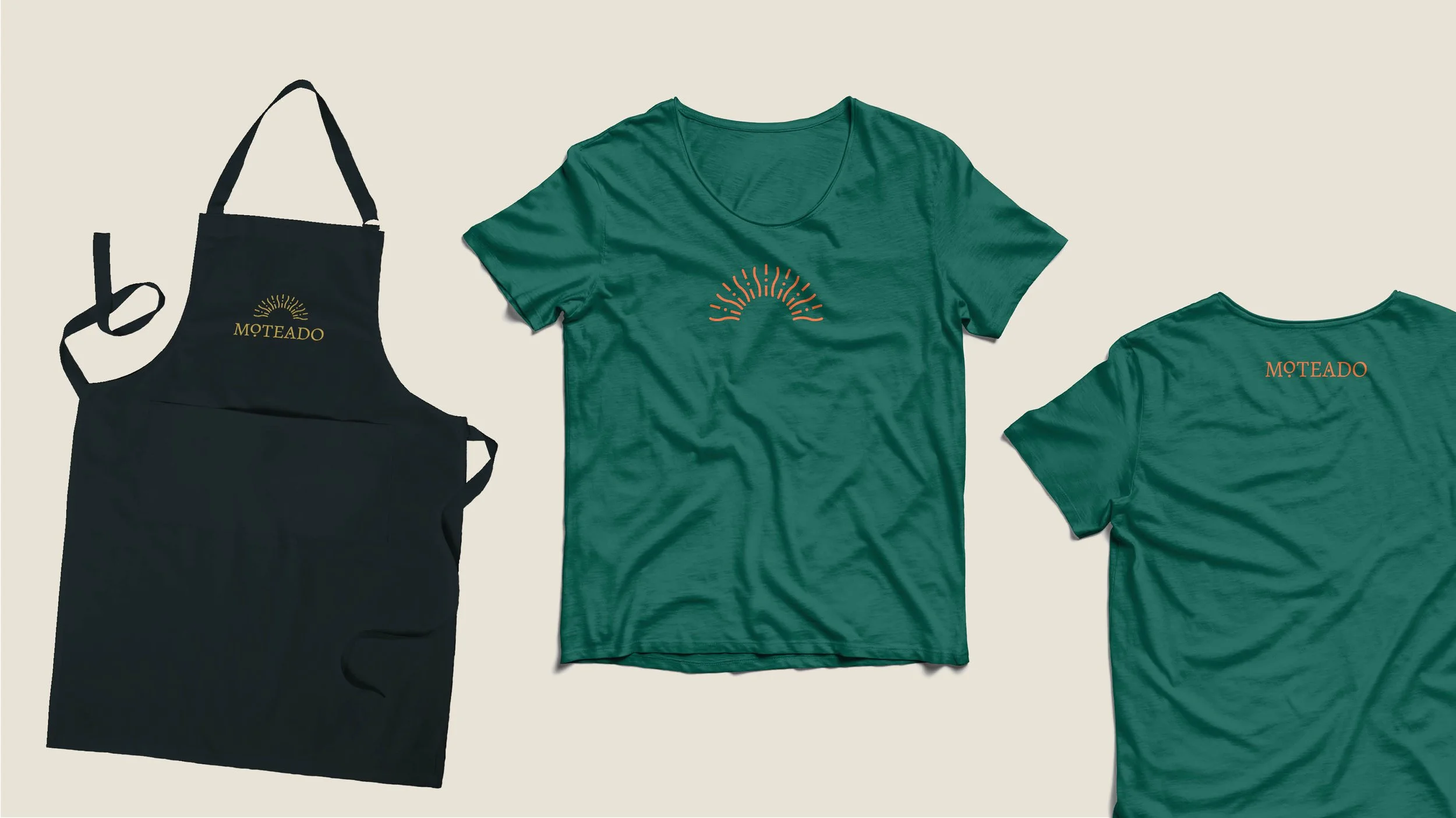
Logo
The keywords used to guide all creative decisions for this brand are genuine, alluring, driven, and noble. The Moteado logo winks at tradition with a dynamic and varied rhythm and letterforms inspired by calligraphy. A modern take on nobility.
Custom Seal
Every element in the seal carries an important message. Its oval shape really differentiates it from the more standard circular seals. The arch represents new opportunities. It is shinning hope along the horizon. The shape also mimics that of a crown or halo, representing the concept of nobility.
Typography and Color
The Moteado color palette pulls from natural elements as well as precious metals and fine fabrics. A strong serif typeface (PT Serif) is balanced with a sensible, hard working sans serif (Roboto).
“From the initial meeting she picks your brain and leads you along a journey of self-discovery, arriving at a final product that truly is a reflection of your vision.”
— Michael, Co-founder, Moteado Mezcal