Piccolina
Piccolina is a children's apparel brand created to inspire the next generation through clothing that celebrates curiosity, confidence, and big dreams. The goal was to develop a brand identity that would stand out in a competitive retail market while appealing to both boutique buyers and modern parents looking for thoughtful, design-forward children's fashion.
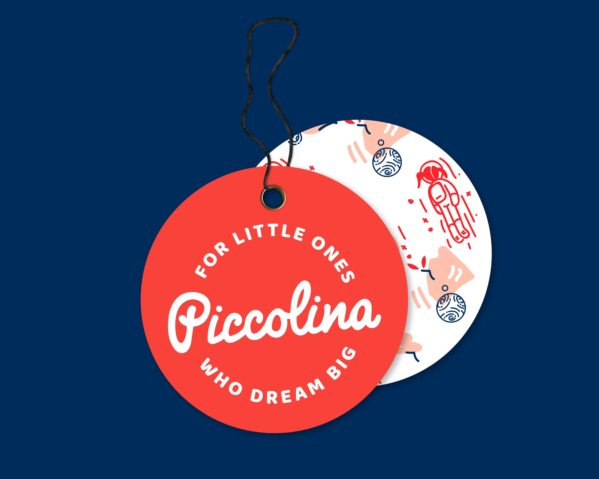
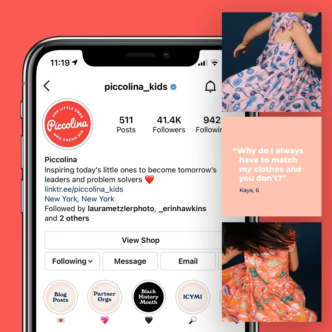
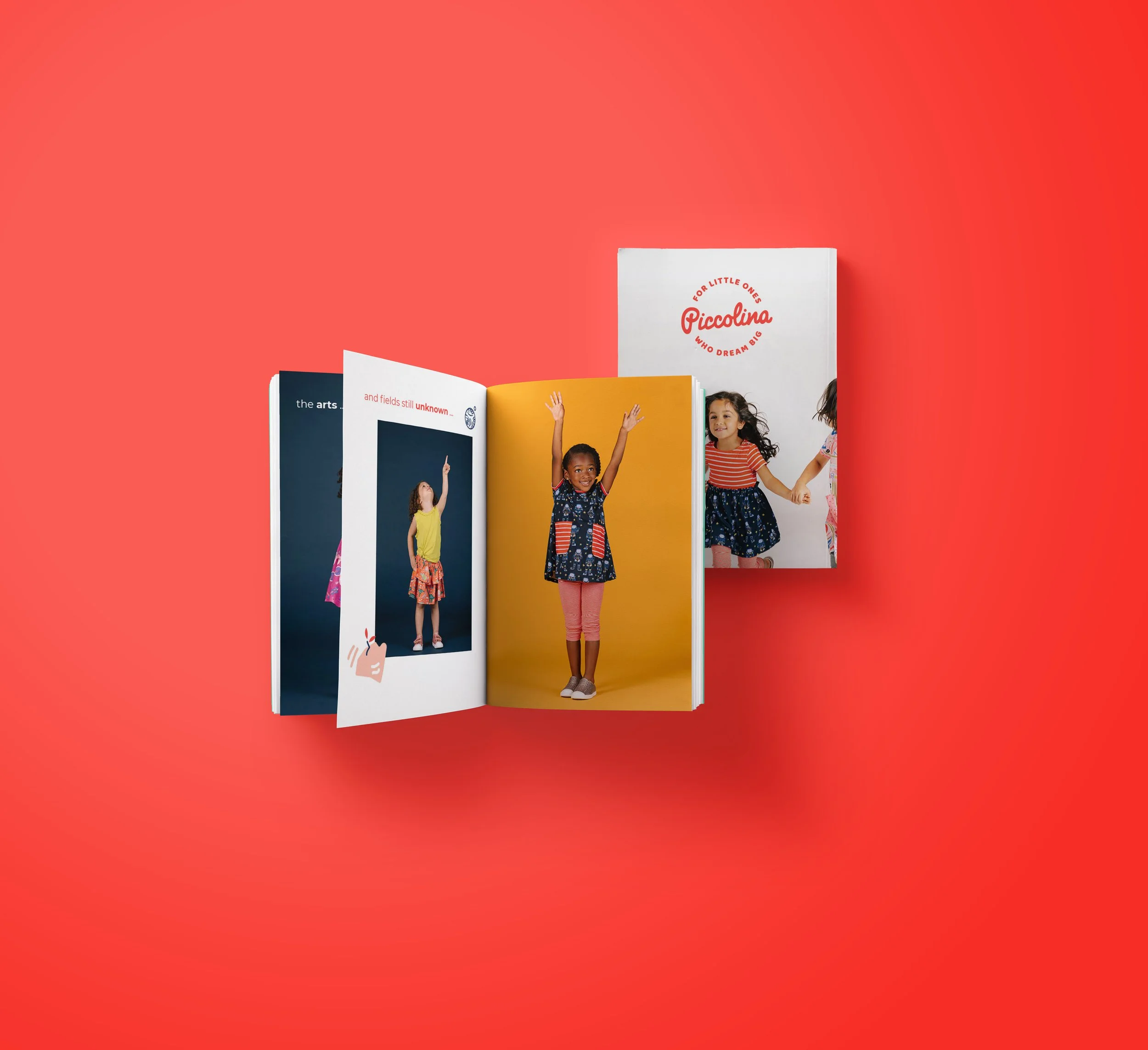
Inspired by the bold optimism of childhood, we created a bright and confident visual identity centered around a custom hand-drawn wordmark, playful illustrations, expressive photography, and a vibrant color palette. The resulting brand feels joyful, modern, and full of personality, giving Piccolina a distinctive presence that supports the clothing without competing with it.
Services Provided
Brand Strategy
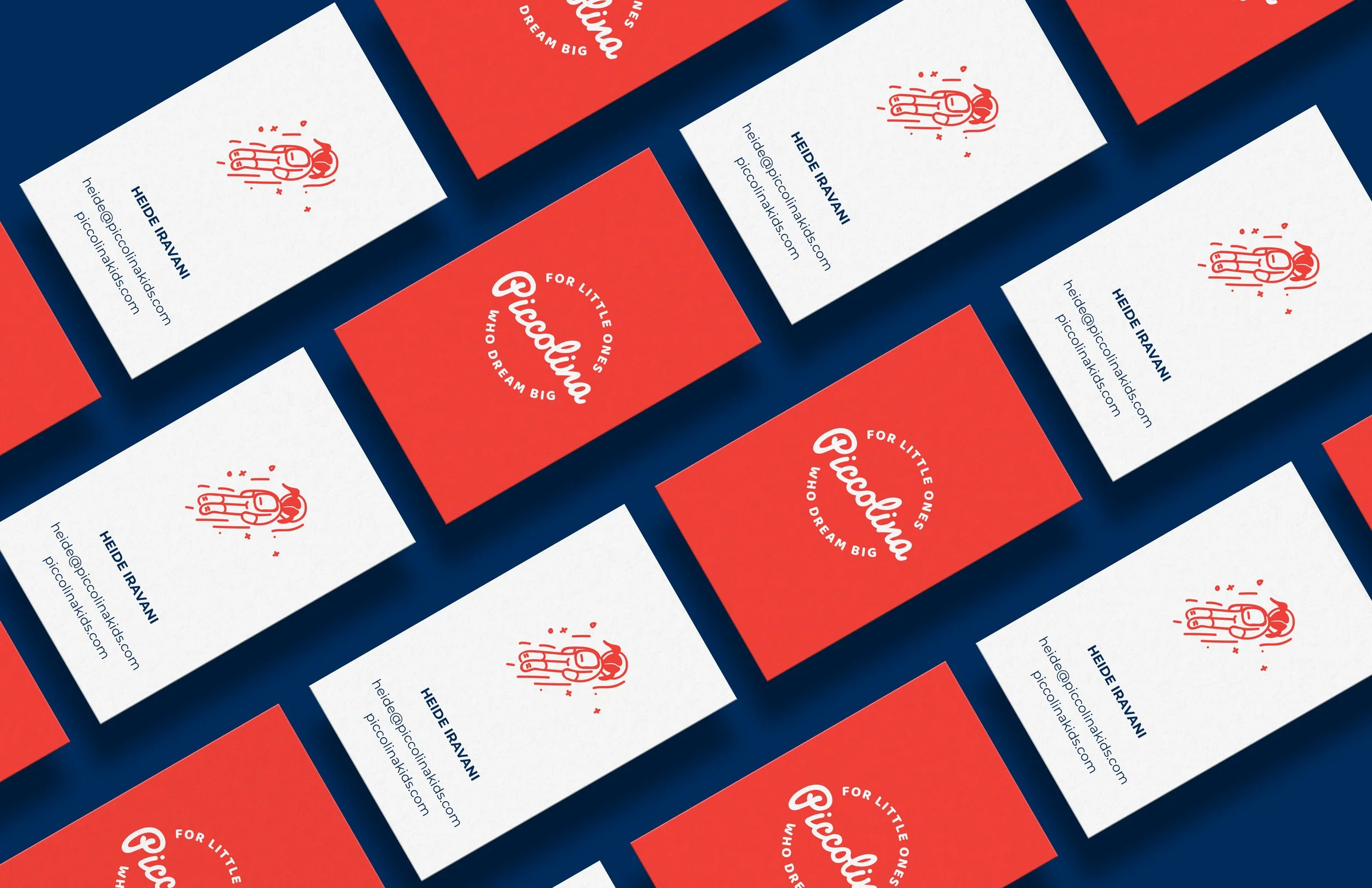
Logo Design
Visual Identity System
Illustration System
Photography art direction and styling
Brand Guidelines
Client
Piccolina