Change Management Playbook
Turning an analog service into a digital service with an intuitive user experience.
Client:
Change Management at Fannie Mae
Date:
2019
Scope:
Creative Direction
UX Strategy
UX Research
Wireframing
Prototyping
Context
Background
The Change Management department and a consulting firm had recently created a new playbook meant to guide employees through the change management process. There was only one problem: the playbook lived in the form of a 100+ slide deck that was wordy, confusing, and difficult to navigate.
Project Objectives
When we took on this project, we had a 153-page slide deck full of change management playbook content, 21 job aides, 28 change cards, and 6 pilot groups to deliver a brand new experience.
Our partners had three main objectives. The first was to enable self-service change. The existing process required their team to guide each change agent through all the material one-on-one. This was a huge effort for a team with limited resources. The second objective was to create awareness and demand for the program. The team wanted to collect data that would prove the need for change management support and coaching. Lastly, the change management team wanted to be able to scale the program to an enterprise-wide transformation.
My Role
As the user experience lead, I was responsible for planning and conducting all user research efforts. I created wireframes and prototypes, testing and iterating throughout the engagement. I provided direction and guidance to visual designers ensuring deliverables met quality standards.
Users
Initial User Interviews
Our team conducted interviews with participants from 6 pilot testing groups established by our partners. We learned about their biggest pain points when it came to consuming content around change. We learned that our customers wanted:
Easy to digest content: Content that change agents needed was discoverable but difficult to scan.
An intuitive experience: Users within our pilot group needed an experience that was easy to navigate.
Context around change: Our pilot groups need to know what to expect and the time involved to enact changes of all sizes.
“Simpler is better…it needs to be really user-friendly and simple and quick.”
– OCM Pilot User
Goals
Definitng Project Goals
Together with our partners, we set a few goals for our MVP:
Create a digital experience accessible to all employees
Move from hand-held to self-service process
Make content accessible and actionable
Employ testing and establish measurement strategy
Process
Content
Our team worked very closely and collaboratively with our partner to make the content more accessible.
Client:
“Change experts have done the content already. We just need design.”
Content Lead:
“Your subject matter expertise is PhD-level. The average person understands best when content is between grade 8 and 10.”
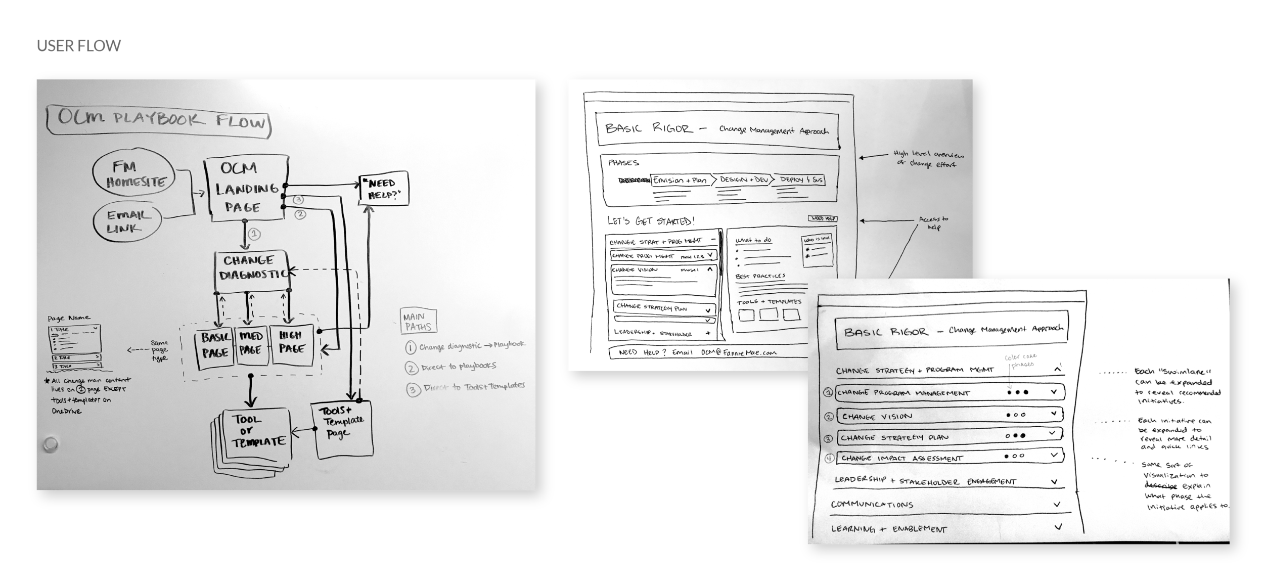
Wireframes
Changing behavior is one of the toughest tasks change agents need to do. Finding the resources they need to do it, shouldn't be.
We simplified how change management content could be discovered and consumed by different change agents. For some, it might be the first big change they're managing, others might be change veterans and only needed access to resources.
We built our initial wireframes alongside rigorous user feedback sessions and change subject matter experts. After refining the layout, we landed on a version that included a homepage, a change diagnostic, change approach pages, and a resource library. This version also incorporated elements of Fannie Mae's design system, which the design team used as a guide to create a cohesive, digital experience for change agents.
“The way the materials were before, I don’t know that I would have been able to get through it without [a human].”
– OCM Pilot User
Visual Design
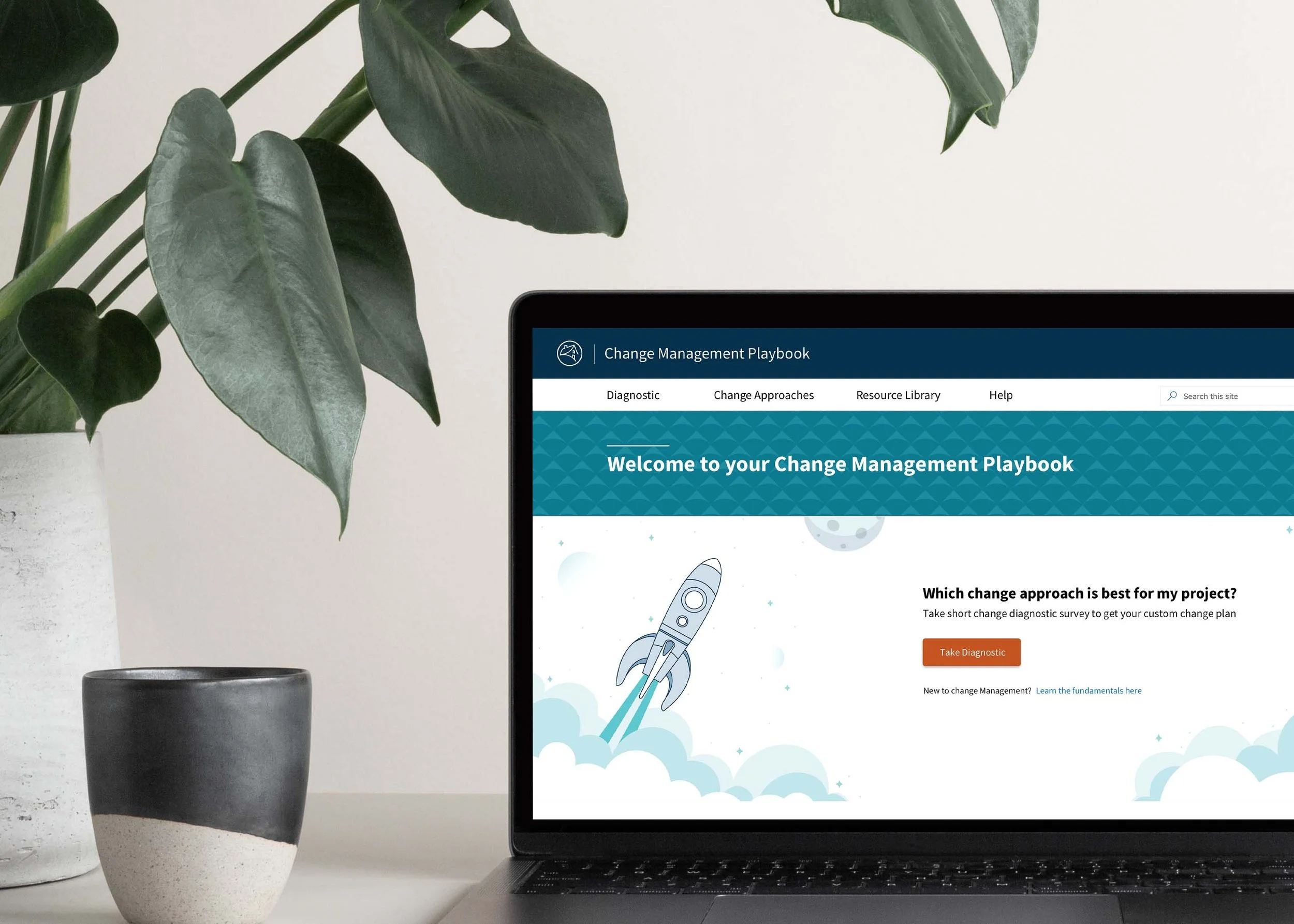
After our initial research, we began ideating concepts to help guide the visual direction of the project. We used a word mapping technique that led us to the space theme. We collaborated with the marketing team to define an illustration approach for the project that would be aligned with the Fannie Mae brand.
The space theme illustrations were repeated throughout the site to evoke excitement around explorations of uncharted territory, which change agents regularly take on.
Big Wins
Reduced reading level from:
Grade 39 to 10
Simplified content from:
153 slides to 3 site pages
We took user research, customer goals, and design inspiration to create the MVP of the OCM Playbook experience. Development was an iterative process where we worked with our pilot groups to incorporate their direct feedback into the tool. The outcome was an MVP that included a homepage, change diagnostic, change rigor pages, and resources.
Our partners were thrilled with the work and have since scaled the program by 400%.
Key Metrics*:
122 average users per month
11 average new users per month
65 minutes spent on site per month
50% of users are doing "basic rigor"
*June 2019-April 2020
“Identifying, delivering, and monitoring change is central to how organizations remain relevant and competitive in the market. By digitizing the change management experience, it has helped galvanize drive adoption and made our change framework, content, and tools intuitive and accessible to the Enterprise.”
— David Miskinyar, Director, Enterprise Program Management


